
Key Takeaways
- Protect Original Architecture: Craftsman interior paint colors are defined by rich woodwork and built-in charm. Choose color palettes that enhance—rather than overpower—these natural features.
- Embrace Nature-Inspired Hues: Earthy and organic tones like sage green, terracotta, warm brown, and olive green create an authentic, grounded connection to the outdoors.
- Balance Light and Warmth: Soft neutrals like beige, cream, and ivory provide a sophisticated, airy backdrop that lets intricate craftsmanship stand out.
- Play with Mood and Depth: For those looking to make a bolder statement, rich jewel tones like deep teal paired with gold bring a sense of luxurious warmth to the space.
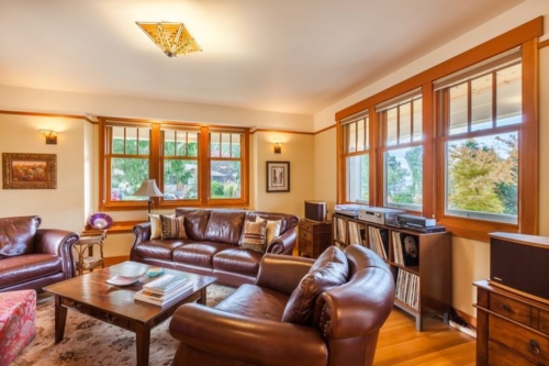
There’s just something magical about a Craftsman home, isn’t there? Between the rich woodwork, built-in charm, and cozy history, a Craftsman interior feels like a warm hug. It welcomes you the second you walk through the door.
If you’re already familiar with all the 12 Classic Features of a Craftsman House Interior, you know how important it is to let that original architecture shine. But if we’re being completely honest, nailing the right color palette to match all that timeless character can feel a little intimidating. You want your space to feel fresh and inviting, but you also don’t want to overpower those gorgeous built-ins and natural wood tones.
Maybe you want to ground your rooms with earthy, nature-inspired hues. Or, perhaps you lean toward something soft and serene. We have rounded up the 10 best color palettes for Craftsman interiors to instantly transform your space. Grab a cup of coffee, and let’s dive in!
1. Earthy Craftsman Interior Paint Colors: Sage Green and Warm Brown
Combine sage green walls with warm brown accents to evoke a connection with nature. When choosing craftsman interior paint colors, sage brings a sense of tranquility, while brown accents ground the space, creating a harmonious and calming environment.
2. Neutral Craftsman Paint Colors: Beige and Cream
Opt for a timeless combination of beige and cream for a sophisticated Craftsman interior. These neutral tones create an elegant backdrop, allowing the intricate woodwork and craftsmanship to stand out while infusing the space with a calming aura.
3. Soft Blues and Whites: Sky Blue and Ivory
Embrace the calming effect of soft blues, like sky blue, paired with ivory accents. This combination mimics the colors of the sky and clouds, bringing a sense of serenity and openness to your Craftsman interior.
4. Rich Jewel Tones: Deep Teal and Gold
For a luxurious and calming atmosphere, consider deep teal walls complemented by gold accents. Deep teal adds depth and richness, while gold accents provide a touch of opulence, creating a calming and elegant Craftsman interior.
5. Nature-Inspired Hues: Terracotta and Olive Green
Incorporate the warm tones of terracotta with the calming presence of olive green. These earthy colors reflect the natural world, promoting a sense of calm and relaxation while infusing your Craftsman interior with warmth and character.
6. Subtle Grays: Charcoal Gray and Soft Silver
Create a soothing ambiance with a combination of charcoal gray walls and soft silver accents. Gray tones provide a neutral backdrop, while silver accents add a touch of sophistication, resulting in a calming and balanced Craftsman interior.
7. Warm Yellows and Browns: Mustard Yellow and Chestnut Brown
Mustard yellow walls paired with chestnut brown accents bring warmth and vibrancy to your Craftsman interior. These colors create a cozy atmosphere, evoking a sense of comfort and tranquility, perfect for relaxation and unwinding.
8. Muted Pastels: Soft Pink and Mint Green
For a softer approach, opt for muted pastels like soft pink and mint green. These gentle hues add a touch of femininity and freshness, creating a calming and charming Craftsman interior that feels serene and inviting.
9. Monochromatic Elegance: Shades of Gray
Explore the calming effect of monochromatic shades of gray, ranging from light silver to deep charcoal. This elegant and understated color palette creates a sense of calm sophistication, allowing the intricate details of your Craftsman interior to shine.
10. Natural Whites and Greens: Ivory and Sage
Bring the outdoors in with a combination of natural whites and sage green. Ivory walls paired with sage green accents create a fresh and calming atmosphere, reminiscent of a peaceful garden. This palette enhances the Craftsman style’s connection to nature, fostering a serene environment in your home.
Bringing Your Craftsman Vision to Life
Adding these calming color combinations to your Craftsman interior enhances its overall beauty. It also creates a tranquil atmosphere where you can truly unwind. Whether you prefer earthy tones, soft pastels, or rich jewel tones, there is a perfect palette to suit your Craftsman style interior and let that gorgeous original architecture truly shine.
Ready to transform your space? If you’re dreaming of giving your home a stunning refresh but aren’t quite sure where to start with your color palette, we’d love to help! Schedule a consultation with our team today, and let’s bring your vision to life.
Frequently Questions
What are the best paint colors for a traditional Craftsman interior?
Traditional Craftsman color palettes lean heavily toward warm, earthy tones inspired by nature. Popular choices include deep olives, sage greens, warm browns, muted golds, and rich terracotta shades that complement natural oak or chestnut woodwork.
Can I use gray paint in a Craftsman-style home?
Yes! While traditional palettes are warm, subtle grays (like charcoal gray or soft silver) can create a beautiful, modern contrast against warm wood trim, provided the undertones aren’t too stark or cold.
How do I choose a paint color that won’t clash with my wood trim?
Look for colors with warm undertones. Earthy greens, warm beiges, and muted yellows naturally harmonize with the golden and reddish hues commonly found in historic Craftsman woodwork. Always test a paint sample directly next to your trim before committing!


