Minimalist interior design has emerged as a timeless and elegant trend, redefining the concept of living spaces in Orange County. This philosophy of “less is more” is captured perfectly through the strategic selection of paint colors.
In this comprehensive guide, we delve into the best paint colors for minimalist homes in Orange County, exploring the versatility of white hues, the warmth of neutrals, the vibrancy of splashes of color, the sophistication of dark tones, and the practical implications of each choice.
1. The Power of White Hues: Achieving Timeless Minimalism
The allure of soft white paint colors is unparalleled in their ability to create a sense of clarity and restoration. Embracing a minimalist vibe is made effortless through shades like White Heron OC-57, Chantilly Lace OC-65, and White Dove OC-17. If you’re seeking a warm and inviting haven, explore beige-tinged creams such as Maritime White OC-5, Ballet White OC-9, and Paper White OC-55. To add, the Benjamin Moore Off White Collection serves as your ultimate resource to find the perfect shade of white, ensuring a harmonious fit for your space.
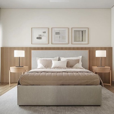
Against a backdrop of white, room elements gain prominence, spotlighting their beauty. Also, painted wood floors, well-chosen furniture, warm wood accents, and plush fabrics lend dimension to classic white canvases. The result? Cozy minimalist bedrooms that transform into airy sanctuaries, exemplifying the captivating essence of minimalism.
2. Layered Neutrals: Infusing Warmth and Coziness
Minimalism doesn’t equate to starkness. Layering earthy hues and natural materials like jute, linen, leather, and wood infuses warmth into minimalist spaces. Besides, the pairing of taupe, grays, and other neutrals creates a cozy cabin-like atmosphere that’s comforting and inviting.
In addition, the minimalist living room comes to life with Revere Pewter HC-172, a favorite from the Historical Collection, showcasing the design prowess of beige and gray—referred to as greige. Other greige options like Pashmina AF-100, Balboa Mist OC-27, and Edgecomb Gray HC-173 from the minimalist color palette resonate with the essence of minimalism. The addition of Simply White OC-117, a previous Benjamin Moore Color of the Year, imbues a luminous glow that aligns perfectly with the minimalist aesthetic.
3. Enlivening Minimalism: Splashes of Captivating Color
Minimalism doesn’t shy away from color—it embraces it strategically. Architectural features deserving of attention—fireplace mantels, accent walls, or window trims—become focal points with intentional color choices. For a bold statement, consider stylized, linear color blocking in a single-shade, monochromatic scheme.
Furthermore, these hues infuse colorful energy against a backdrop of blonde wood floors and white walls, creating an inviting atmosphere that resonates with minimalist principles.
4. Bold Paint Hues: Elevating Minimalism’s Vibrancy
While neutrals are integral to minimalism, the strategic use of bold, saturated colors can elevate the style to new heights. Saturated jewel tones like Beau Green 2054-20, Bronze Tone 2166-30, and Starry Night Blue 2067-20 from the Color Trends 2023 palette serve as focal points that enhance the overall minimalist style.
Creating a cohesive color envelope is exemplified by the all-green Balsam 567 on cabinets and walls. Coupled with a crisp white ceiling, these adventurous colors heighten walls and add an illusion of space. What’s more, the interplay of sheen is equally essential, as seen in a kitchen corner where a satin finish on walls and an ultra-flat finish on the ceiling adds depth and dimension.
5. Sophisticated Elegance: Black Paint Colors in Minimalism
Classic black hues introduce an element of drama and sophistication to minimalist design. Pairing crisp white paint colors with intense black tones results in a streamlined yet impactful look.
Cloud Cover OC-25 alongside Black Tar 2126-10 demonstrates this synergy in a contemporary minimalist kitchen. These enigmatic hues bring both cool and calm to the space, showcasing the compatibility of contrasting elements within minimalism.
6. Pale Pastels: Introducing Subtle Personality
In the realm of minimalist interior design, achieving a delicate balance between simplicity and personality is a true art. If you’re yearning to infuse a touch of color into your minimalist haven while preserving its tranquil essence, consider the enchanting world of pale pastel shades. Besides, these soft, muted hues offer a graceful means to introduce subtle personality into your space without overshadowing the inherent minimalistic charm.
Imagine a pale mint shade gently gracing your walls, reminiscent of a springtime breeze. This delicate hue brings a whisper of color, evoking feelings of freshness and renewal. Paired with clean lines and uncluttered design elements, pale mint infuses your minimalist space with an inviting aura that’s both enchanting and restorative.
7. Cool Blues: Calm and Serene Ambiance
Among the spectrum of colors, few can rival the calming allure of cool blues. Light shades like “Palladian Blue” and “Silver Lake” paint the canvas of your minimalist interiors with hues that echo the serenity of open skies and tranquil waters. In addition, these cool tones evoke a sense of vastness and freedom, perfect for spaces where minimalism meets a desire for peaceful contemplation.
8. Subdued Greens: A Connection to Nature
Minimalism often seeks to establish a connection with the natural world, and what better way to achieve this than through soft green tones? “Sage Green” and “Sea Salt” are hues that resonate with the calm and rejuvenating energy of nature. Also, these colors seamlessly integrate the outdoors into your minimalist sanctuary.
“Sage Green” embodies the subtle elegance of leaves, capturing the essence of renewal and growth. As it graces your interiors, it introduces a touch of vitality, nurturing a sense of harmony and balance that aligns perfectly with minimalist principles.
Additionally, “Sea Salt”, reminiscent of the ocean’s gentle embrace, invites the calming influence of water into your space. This muted green tone is a reminder of serenity, evoking feelings of tranquility and calm. Then, when combined with minimalist aesthetics, “Sea Salt” creates an environment that invites mindfulness and introspection.
Take a look at Coastal Colors: Perfect Palette for Beachy Vibes for more additional inspiration.
About Us:
Founded in 2017, Satin and Slate is one of the elite interior design studios in Southern California. Located in Long Beach, this dedicated team of designers oversees from kitchen and bathroom renovations to commercial projects. Equipped with their own showroom/studio they can satisfy the needs of any client. Featuring clean lines, bright colors and fresh ideas Satin and Slate’s mission is to bring your vision to life and help transform your space into something extraordinary.


